.png)
Beyond a Union: Becoming the Brand Players Talk About in the Locker Room

The SNB (National Basketball Players’ Union) was facing a decline in the appeal of its value proposition. With players increasingly individualistic and coming from all over the world, the Union struggled to convince them of what it could truly offer. Too often perceived as the body you turn to only when things go wrong, the SNB wanted to clarify its role in the basketball ecosystem and highlight its contribution to players’ careers.

The challenge
No doors were to remain closed — that was our guiding principle when starting our collaboration with the SNB. The goal was to boost the attractiveness and clarity of the Union’s offer for male and female basketball players in France. The rebrand had to be delivered at record speed to support the club tour at the season’s opening and to accompany the launch of a new app designed to strengthen proximity with players.

What we did
After consulting multiple stakeholders within the French basketball ecosystem, we highlighted the need to better align with players’ aspirations while clarifying the Union’s role within the wider basketball community in France. The Union needed to be seen as an organisation that unites, not one that divides.
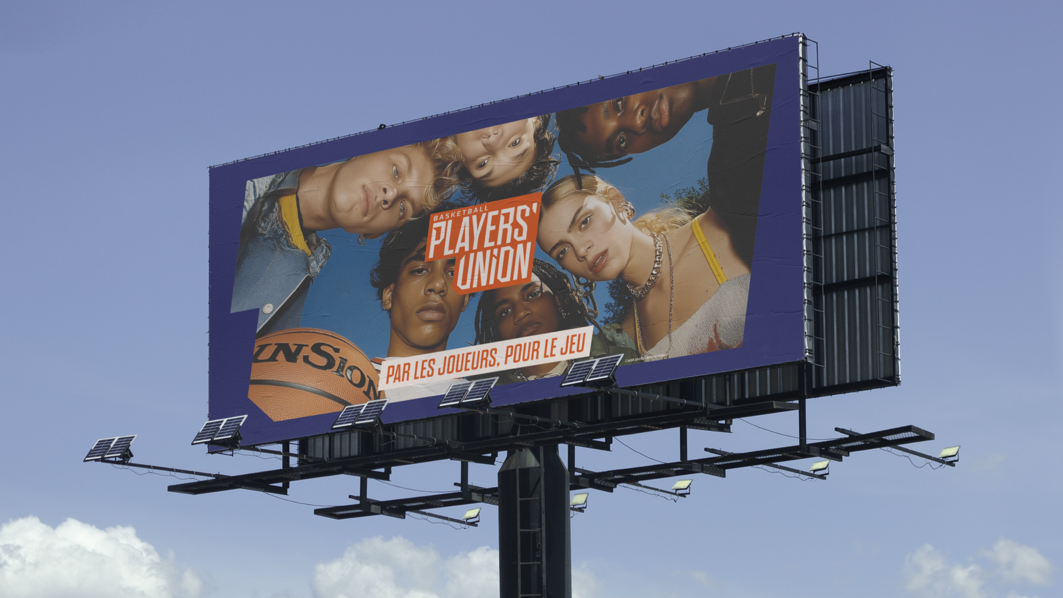
We therefore built the brand platform around the idea: “By the players, for the game.” The aim was to show that without strong support for players throughout their careers, the entire French basketball market suffers.
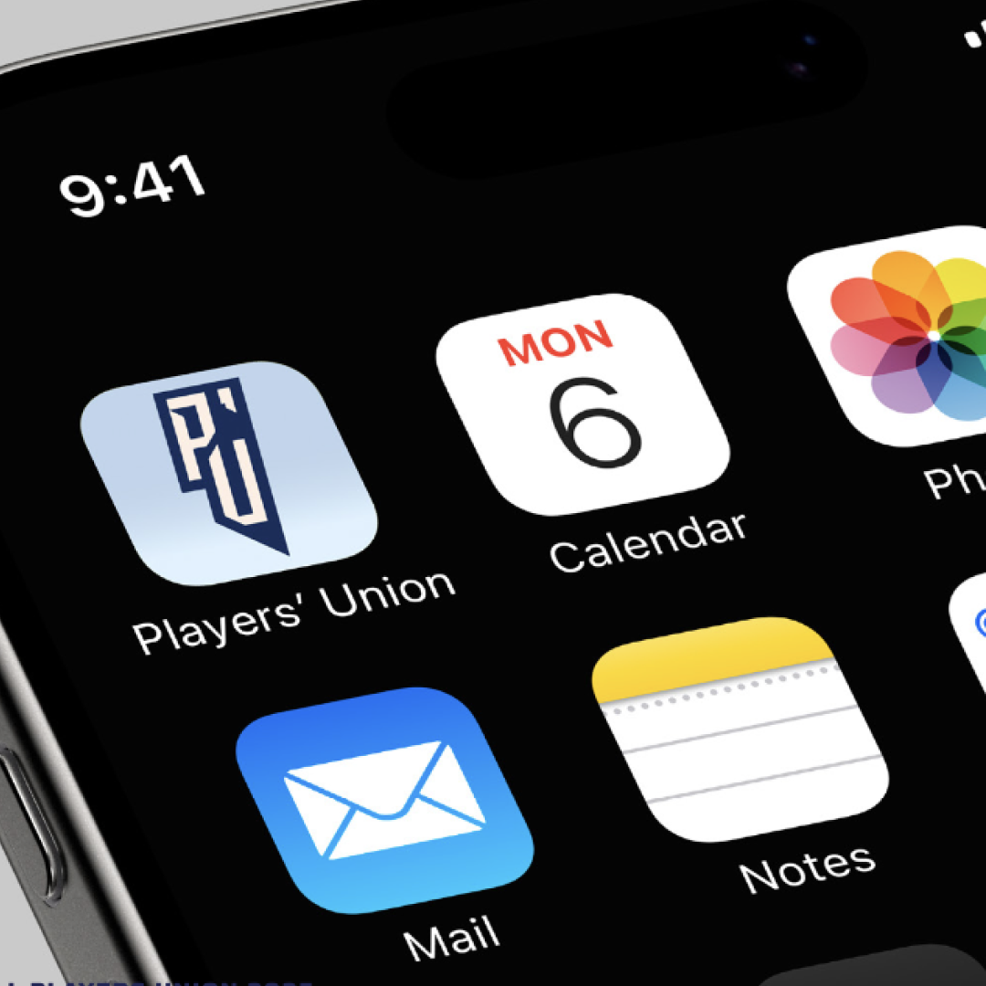
With French championships now highly cosmopolitan, foreign players struggled to understand what the SNB was. To address this, we evolved the name for greater clarity among international players. By becoming the Basketball Players’ Union, the mission was instantly understandable. The shorthand “Players’ Union” made it easier for everyone to refer to “the Union,” creating greater proximity than the more distant vocabulary of “syndicate.”
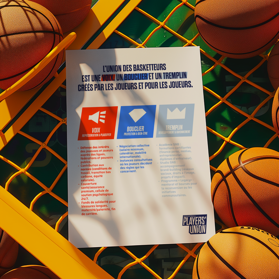
Finally, we reshaped the offer around a three-part framework: Voice, Springboard, and Shield — showing both the Union’s role in elevating careers and in protecting players.
Between media and corporate branding
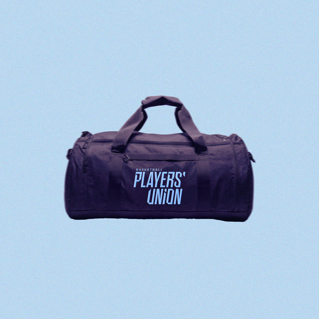
Visually, we reconnected with the language of sport. Between media brand and institution, we struck the right balance. The logo block is modular, suggesting acceleration, and can be adapted with or without the word “basketball,” depending on the medium. The “PU” block comes to life within the app.
Orange, once omnipresent, was moved to a secondary role. A palette of light blue, midnight blue and soft beige was introduced to create a brand that feels more reassuring, serene, and authoritative.
The visual identity system was designed to make life easier for the Union. With limited resources, the Basketball Players’ Union needed to be able to produce quality content without an in-house graphic designer. The branded shapes are therefore simple, as are the typography and colour combinations.
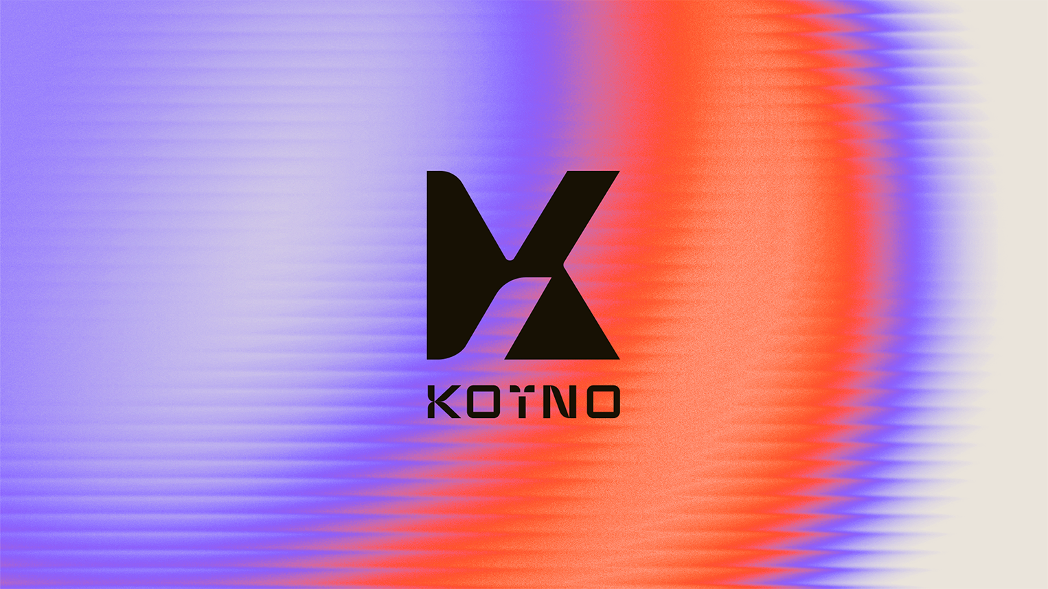
Finally, we created a monogram evoking a basketball, reminding everyone of the sport the Union represents. For the trained eye, it subtly embeds the letters SNB, paying tribute to the Union’s legacy.

The outcome
• During the club tour, the Union enjoyed much greater clarity around its offer.
• International players now clearly identify the Basketball Players’ Union (formerly SNB) as the representative body for basketball players in France.
• Younger players note the modernised feel and are more inclined to use the Union’s app.
Long live the Players’ Union!